

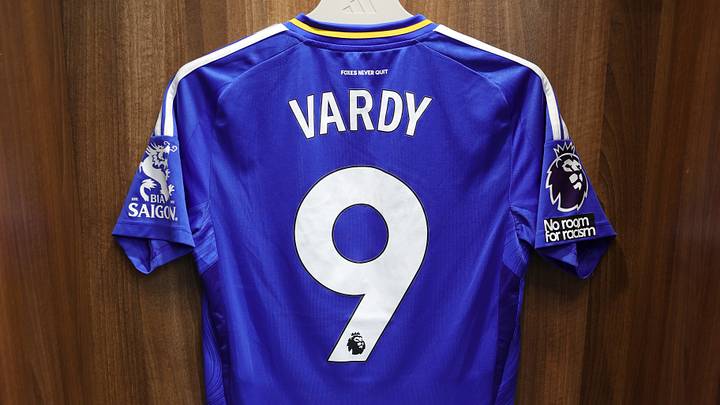
The King Power Club have made a habit of sometimes absolutely nailing kit designs, and other times giving us nothing more than a handkerchief dressed up in pretty colours. In this season of kit announcements, with a near-perfect home kit announced and a highly-anticipated away kit on the way, it is paramount to gaze into our past and proclaim which kits are the best and which kits are the worst.
Of course, it is worth noting the self-imposed recency bias with only looking back at the last decade, and further to this, the obvious personal bias that I have. Specifically, what I look for in a kit is not 'classic'; it needs to be adventurous, interesting, colourful, and ideally have a pattern. So, do not be surprised by the lack of standard home kits in the ranking.
Leicester City's best five kits of the decade
5. 2023/24 - Home Kit
During our storming Championship run under Enzo Maresca, the Foxes had a couple of banger designs. It was a toss-up between the mustard yellow third kit and the home kit, but I have placed the patterned home kit ahead. With a fox-head pattern across simple stripes overlaid lightly on the royal blue base, simple white stripes on the shoulders and down the sides, the 2023/24 home kit screamed quality and screamed Leicester. Plus, it brought back the King Power sponsor rather than the awful FBS and BC Game sponsors.
4. 2025/26 Third Kit
During that dismal Premier League relegation campaign, Leicester launched a third kit reminiscent of one of my favourite away kits from 2019/20: a pink one! However, the 25/26 pink had a gorgeous monochrome club badge, a stripe down the right side and a simplified black Adidas logo on its left. It was simple, colourful, and an iteration on what was a slightly clunky design previously.
3. 2022/23 - Home Kit
The 2022/23 Premier League season was another poor showing for the King Power side, but they did have a home kit I actually liked. It was a simple and classic blue kit without any pattern whatsoever and a hideous FBS sponsor on its front. However, it sported a white polo-style collar. For some reason, that collar mixed with clean white stripes on the shoulders made for a fresh take after a couple of seasons of messy home kits.
2. 2017/18 - Away Kit
Black and gold. There exists no better combination of colours. A sleek, black away kit with golden accents, the logo, sponsor, and club badge all in that golden shine. This was the last season with Puma kits, and they did an excellent job on a clean and well-designed kit. Plus, the golden shoulders were a standout feature at the time.
1. 2020/21 - Away Kit
My favourite kit actually removes the need for a pattern of colours. It was simple, fresh, a gorgeous colour, and worn during a cup-winning run which put the Foxes squarely in the top six. Unfortunately, that was not to last. The year of Wesley Fofana, the year we won the FA Cup; the Maroon away kit heralding the 'Thailand Smiles with You' sponsor, a sensational colour and a sensational sponsor.
Honourable Mentions
An honourable mention to two kits. First, the 2023/24 third kit. Again, our Championship-winning campaign. It featured a colourful and vibrant mustard-yellow base with black accents. The only downsides to this kit were the proximity to being a Wolverhampton Wanderers kit, and the white King Power sponsor text instead of going for the black to match the club badge.
Second, the 2021/22 away kit. A mint square and crisscross patterned away kit. I do not have much to say, beyond that it could be mistaken for a towel in design, but damn, it was pretty, different, and my favourite colour, alongside a navy accent and navy sponsor; the away kit just looked good.
Leicester's worst two kits of the last decade
On the other hand, I seldom 'hate' kits, since they usually look interesting enough to be considered something worth purchasing for those who like representing their club. However, there are at least two from the last decade which really invite my ire.
I despise the 2021/22 third kit. This grey-based, neon pink-accented, non-patterned shirt with black collar and sleeve rims, with white sponsor text and Bia Saigon logo on the arm... was hideous. The colours did not mix well at all, and although it looked better in person than in pictures, it was still amongst the worst kits I have ever seen the Foxes play in, and I pray they never mix that many colours with such a basic and boring coloured base ever again.
Although I initially liked it, the 2022/23 third kit was different, and I loved the pattern. Whenever I wear it, the kit is just too messy with a white base, odd dull yellow shoulders, mixed with a subtle dull yellow dotted pattern. The only saving grace was the burgundy accents for the logo, sponsor, and shoulder stripes. I wish they ditched the dull yellow and just had a white base with the burgundy colour and some subtle golden stripes instead.
Which designs did you like over the last decade? If I missed any, such as the red kit, please let us know through our social media channels what you think. For reference, the 2026/27 home kit is already possibly my favourite home kit yet, and the retro-inspired away kit awaiting announcement is eagerly anticipated.
 Add us as a preferred source on Google